
 Portal
Grey Buttons
+9
Beno
Sanket
Rabu
Hallucinogen
WhitePoint
RikaComet
incredible_fear
Master Marc
Woopz
13 posters
Page 1 of 1


Woopz- New Member
-
 Posts : 21
Reputation : 0
Language : English

 Re: Grey Buttons
 by Master Marc September 14th 2009, 4:56 am
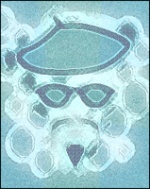
~The font size is too small
~You should add some icons to the left and use the text to the right
~The white edges looks weird
~They would look better if they were not squared
~Try to get a flashy font color to go with the button
I'll give them a 2/10,
~You should add some icons to the left and use the text to the right
~The white edges looks weird
~They would look better if they were not squared
~Try to get a flashy font color to go with the button
I'll give them a 2/10,

Master Marc- Hyperactive
- Posts : 3661
Reputation : 47
Language : English and Spanish.
Re: Grey Buttons
by incredible_fear September 14th 2009, 12:43 pm
Those are nice but it will be good if you put some icons & change the font..
Last edited by incredible_fear on September 15th 2009, 10:52 am; edited 1 time in total

incredible_fear- Active Poster
- Posts : 1582
Reputation : 133
Language : English
Re: Grey Buttons
by RikaComet September 14th 2009, 10:07 pm
i have to say that i liked the base a bit base only gets 7/10
its kinda of innovative and usually people use uniform edges or dark grey ones
as said above me the text is not goods, makes a good web 2.0 base look like phpbb2 one, 90's gfx seriously
a very good point given by master marc above me, the buttons will look good if you reduce the height a bit
its kinda of innovative and usually people use uniform edges or dark grey ones
as said above me the text is not goods, makes a good web 2.0 base look like phpbb2 one, 90's gfx seriously
a very good point given by master marc above me, the buttons will look good if you reduce the height a bit
RikaComet- Active Poster
- Posts : 1536
Reputation : 18
Language : English , Hindi , Arabic , Urdu, Japenese , Punjabi , German
Location : thing called Earth
Re: Grey Buttons
by WhitePoint September 15th 2009, 11:07 am
Although he had some work to pictures, I like
7/10
7/10

WhitePoint- Active Poster
- Posts : 1206
Reputation : 11
Language : Romanian, Spanish, English, Catalan and a little French
Location : Tarragona, Spain -

Re: Grey Buttons
by Hallucinogen September 16th 2009, 4:19 pm
I have no idea why you guys insist on the images on icon.
I cannot imagin these buttons with images on them however, you should decrease the height of the buttons.
They look slick in my point of view.
Good job.
8/10
I cannot imagin these buttons with images on them however, you should decrease the height of the buttons.
They look slick in my point of view.
Good job.
8/10

Hallucinogen- Forumember
- Posts : 44
Reputation : 0
Language : English, French, Chinese, Korean, HTML, BB, PS, Java
Re: Grey Buttons
by Woopz September 16th 2009, 7:14 pm
Thanks for the comments.
I'll try to decrease the height of my next proposal.
Once again, your comments are very supportive Hallu.
I'll try to decrease the height of my next proposal.
Once again, your comments are very supportive Hallu.
Woopz- New Member
- Posts : 21
Reputation : 0
Language : English
Re: Grey Buttons
by Rabu September 26th 2009, 8:45 pm
My Review:
¤ Nice Gloss
¤ Unique
¤ Awesome design
¤ Rightful & Great font
10/10
¤ Nice Gloss
¤ Unique
¤ Awesome design
¤ Rightful & Great font
10/10

Rabu- Forumember
- Posts : 308
Reputation : 0
Language : English and Spanish.
Location : Not important.

Sanket- ForumGuru
- Posts : 48766
Reputation : 2830
Language : English
Location : Mumbai
Re: Grey Buttons
by Beno September 27th 2009, 7:54 pm
Hi,
Please view the following suggestion for the images....
Good
* Gloss Look
* Text Style
* Nice Beval
Improvements
* Make sure on the image that we straighten the the white gloss part at the bottom , it might be a bit picky but its a little uneven.
* Suggestion- Move the drop shadow a little so that its under the whole image not just the corner.
Conclusions
I do like these images personally and I don't agree with others above about the font or putting images on.
8/10
+ 2 if you did the following improvements

Beno- Hyperactive
- Posts : 3024
Reputation : 67
Language : English
Location : England -
Re: Grey Buttons
by Walshy95 September 27th 2009, 11:00 pm
They look like a kind of vB based theme, and I like that a lot. I would recommend using icons on the left, and also allign the text onto the right to make it stand out more.
5/10
5/10
Walshy95- Active Poster
- Posts : 1308
Reputation : 6
Language : English
Location : UK, Liverpool
Re: Grey Buttons
by Josiejane September 29th 2009, 8:21 pm
I think that the text is really nice i like the text and the colours of the text but the area and perimeter of the regtangle is to large for a button i would either make the text just a little bit bigger or just shorten the length.
8/10
8/10

Josiejane- Forumember
-
 Posts : 85
Reputation : 0
Language : The only what that makes sense
Location : Nowhere -

LH Justin- Hyperactive
- Posts : 3686
Reputation : 121
Language : English
Location : United States
Mike- Hyperactive
- Posts : 4255
Reputation : 471
Language : English, HTML, CSS
Location : Loveland, Colorado
» Grey Buttons
» Grey buttons
» Set animation grey buttons with arrow
» [grad][blank]Buttons(grey)
» Dark Grey Navigation Buttons
» Grey buttons
» Set animation grey buttons with arrow
» [grad][blank]Buttons(grey)
» Dark Grey Navigation Buttons
Page 1 of 1
Permissions in this forum:
You cannot reply to topics in this forum Facebook
 Twitter
 Pinterest
 Youtube
