 Hitskin.com


 by Daniel Z February 1st 2015, 10:37 pm
Technical Details
Forum version : PunBB
Position : Administrator
Concerned browser(s) : Other
Screenshot of problem : https://i.imgur.com/NQbjfS1.png
Who the problem concerns : All members
When the problem appeared : After editing the header
Forum link : http://www.rpg-players.com/
Description of problem
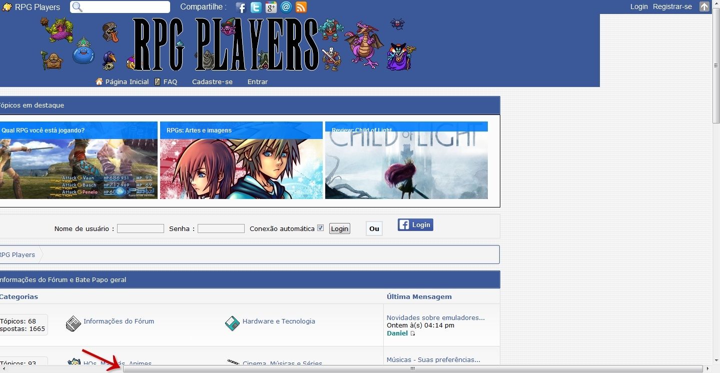
Hello, everyone.After editing the forum header, the layout seemed no problem for me, as administrator and a PC user.
After publishing the changes, forum members who use cellphones or tablets, notified me that the look was wrong.
Somehow, the site is all to left for those using cellphones and tablets.
As shown in the attached image, i ask for help to correct any error that i has committed.
These were the scripts that I modified:
- Code:
#logos1 {
line-height: 160% !important;
background-image: url('http://i.imgur.com/vCVDBHB.png') !important;
background-repeat: repeat-x;
}

ul#nav{
line-height: 20px !important;
padding-left: 51% !important;
padding-right: 50% !important;
margin-right: -50% !important;
}

#nav {
position: relative !important;
left: -30% !important;
background-image: url('http://i.imgur.com/vCVDBHB.png') !important;
background-repeat: repeat-x !important;
width: 720px !important;
}

#pun-logo {
left: 10% !important;
position: relative !important;
}

#logos1 {
    background: url('http://i.imgur.com/rMk70TE.png');
    height: 120x;
    line-height: 120px;
}

.logos2 {
    width: 1024px;
    margin: 0 auto;
}

#pun-logo {
    margin-top: 40px;
}

#pun-logo img {
    -webkit-transition-duration: 1s;
    -moz-transition-duration: 1s;
    -o-transition-duration: 1s;
    transition-duration: 1s;
    background-repeat: no-repeat;
}

ul#nav li.menuitem {
float: left !important;
margin-right: 10px !important;
list-style: none !important;
margin-top: none !important;
margin-bottom: none !important;
}

ul#nav li a {
color: #fff !important;
text-decoration: none !important;
padding-left: 20px !important;
text-shadow: 0 1px #666 !important;
}


 Facebook
 Twitter
 Pinterest
 Youtube
