
 Home
HomeDifference between the desktop view and the mobile view of layout
2 posters
Page 1 of 1

 Difference between the desktop view and the mobile view of layout
 by Daniel Z February 1st 2015, 10:37 pm
Technical Details
Forum version : PunBB
Position : Administrator
Concerned browser(s) : Other
Screenshot of problem : https://i.imgur.com/NQbjfS1.png
Who the problem concerns : All members
When the problem appeared : After editing the header
Forum link : http://www.rpg-players.com/
Description of problem
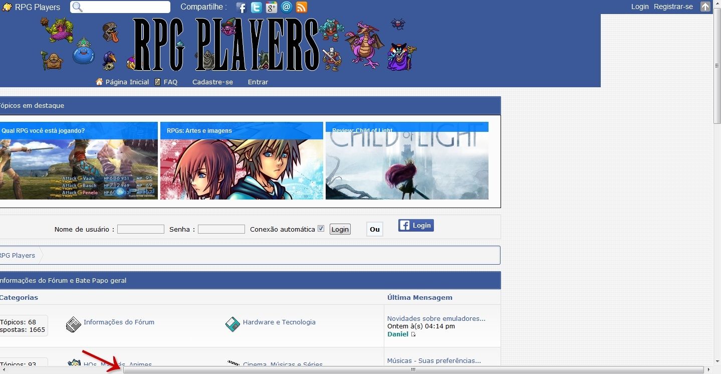
Hello, everyone.After editing the forum header, the layout seemed no problem for me, as administrator and a PC user.
After publishing the changes, forum members who use cellphones or tablets, notified me that the look was wrong.
Somehow, the site is all to left for those using cellphones and tablets.
As shown in the attached image, i ask for help to correct any error that i has committed.
These were the scripts that I modified:
- Code:
#logos1 {
line-height: 160% !important;
background-image: url('http://i.imgur.com/vCVDBHB.png') !important;
background-repeat: repeat-x;
}

ul#nav{
line-height: 20px !important;
padding-left: 51% !important;
padding-right: 50% !important;
margin-right: -50% !important;
}

#nav {
position: relative !important;
left: -30% !important;
background-image: url('http://i.imgur.com/vCVDBHB.png') !important;
background-repeat: repeat-x !important;
width: 720px !important;
}

#pun-logo {
left: 10% !important;
position: relative !important;
}

#logos1 {
    background: url('http://i.imgur.com/rMk70TE.png');
    height: 120x;
    line-height: 120px;
}

.logos2 {
    width: 1024px;
    margin: 0 auto;
}

#pun-logo {
    margin-top: 40px;
}

#pun-logo img {
    -webkit-transition-duration: 1s;
    -moz-transition-duration: 1s;
    -o-transition-duration: 1s;
    transition-duration: 1s;
    background-repeat: no-repeat;
}

ul#nav li.menuitem {
float: left !important;
margin-right: 10px !important;
list-style: none !important;
margin-top: none !important;
margin-bottom: none !important;
}

ul#nav li a {
color: #fff !important;
text-decoration: none !important;
padding-left: 20px !important;
text-shadow: 0 1px #666 !important;
}

Daniel Z- New Member
- Posts : 23
Reputation : 1
Language : Portuguese -


Re: Difference between the desktop view and the mobile view of layout
by Ange Tuteur February 2nd 2015, 3:20 am
I noticed this is causing some horizontal overflow ( scrollbar ) :
If you're attempting to center these elements, I'd recommend using text-align center.
Basically, apply text-align center to your logo container :
Remove everything except line-height :
Remove position, left, and width from this :
remove this :
Replace this :
By this :
- Code:
ul#nav{
line-height: 20px !important;
padding-left: 51% !important;
padding-right: 50% !important;
margin-right: -50% !important;
}
If you're attempting to center these elements, I'd recommend using text-align center.
Basically, apply text-align center to your logo container :
- Code:
.logos2 { text-align:center; }
Remove everything except line-height :
- Code:
ul#nav{
line-height: 20px !important;
padding-left: 51% !important;
padding-right: 50% !important;
margin-right: -50% !important;
}
Remove position, left, and width from this :
- Code:
#nav {
position: relative !important;
left: -30% !important;
background-image: url('http://i.imgur.com/vCVDBHB.png') !important;
background-repeat: repeat-x !important;
width: 720px !important;
}
remove this :
- Code:
#pun-logo {
left: 10% !important;
position: relative !important;
}
Replace this :
- Code:
ul#nav li.menuitem {
float: left !important;
margin-right: 10px !important;
list-style: none !important;
margin-top: none !important;
margin-bottom: none !important;
}
By this :
- Code:
ul#nav li.menuitem {
display:inline-block;
margin-right: 10px !important;
list-style: none !important;
margin-top: none !important;
margin-bottom: none !important;
}

Ange Tuteur- Forumaster
-
 Posts : 13246
Reputation : 3000
Language : English & 日本語
Location : Pennsylvania -
Re: Difference between the desktop view and the mobile view of layout
by Daniel Z February 2nd 2015, 6:19 pm
Fantastic work, @Ange Tuteur.
Could you please fix these areas to fit the same which you fixed? (?)


The background colors did not follow the same width.
Could you please fix these areas to fit the same which you fixed? (?)
The background colors did not follow the same width.
Daniel Z- New Member
- Posts : 23
Reputation : 1
Language : Portuguese -
 Similar topics
» how to force Desktop on mobile
» New mobile version jumps to desktop version
» return from desktop to mobile version
» Problems using desktop view (classic) on an iPad
» Incorrect Table width scaling in desktop mode on mobile devices
» New mobile version jumps to desktop version
» return from desktop to mobile version
» Problems using desktop view (classic) on an iPad
» Incorrect Table width scaling in desktop mode on mobile devices
Page 1 of 1
Permissions in this forum:
You cannot reply to topics in this forum Facebook
 Twitter
 Pinterest
 Youtube
