Forumotion Christmas Banner Contest@Anzo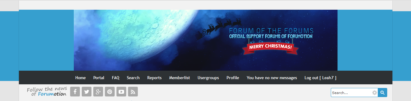  | Challenge Completion |  |
 | Font & Text Legibility |  |
| Color Choices | |
| Harmony | |
| Balance |  |
| Movement | |
| Theme Integration |  |
My Critique
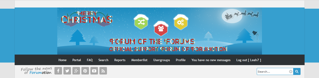
- Your forum was really great! It doesn't hurt my eyes, the elements are harmonious, and the elements are spread evenly on the banner. However, as you might observe in the picture above, the banner doesn't blend in with the theme.
The background of your banner is very different from the background of the header. It makes the banner and the header have a gap between one another; they look like their from different themes. As a designer, your main goal is to provide excellent graphics to match the client's delight. You however did provide an excellent banner, however it doesn't match the theme and makes the theme look bazaar.
The theme of this forum is modern, yet the banner you provided is not quite modern. Modern themes are flat, and the banner that you designed was 3-dimensional. It creates another gap between the banner and the theme, and makes the viewers feel uncomfortable. When creating a banner, make sure that that it blends in with the theme and doesn't stand out against the banner that much. If the banner did stand out that much, the banner will create a gap between the theme and the banner. The intensity of the banner should match the theme. When creating a banner, make sure that you match the style of not only the theme, but the forum itself.
The banner you provided was quite cloudy and dark, making it look mysterious. Yet, the forum you created the banner for was not focusing on mysterious subjects but focused more on helping others with forums. It didn't match the forum.
When creating a banner, make sure that it's not only beautiful but it blends in with the forum subject and theme. This way, the banner appears to be more beautiful and the banner stands out with the theme, not against it.
Favorite Features
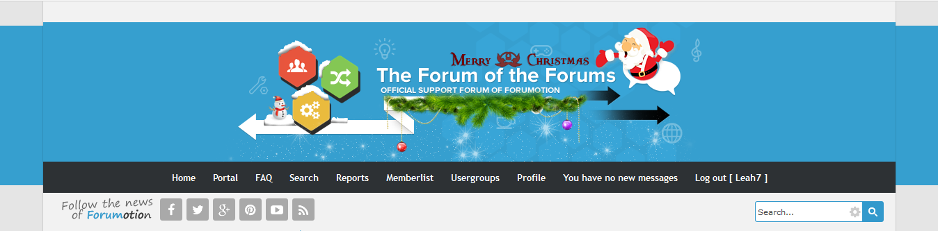
- The banner you created is an example of harmony. The colors fit nicely together and don't contrast. The dark and mysterious aura was surrounded by clouds, making the banner look harmonious and mysterious at the same time. The big moon in the night sky, shining an even lighter shade of white, boost up the curiosity of the viewers. Santa in black made it even mysterious. Entirely, the banner you made was in harmony.
The elements of the banner were evenly spread out on the banner. This makes it look balanced. If your banner is balanced, it means that neither one of the sides of the banner gets left out. Each side has elements, making the viewer doesn't only focus on the center but the sides as well.
The banner you made has a slow rhythm, and the slower the rhythm the more relaxed and mysterious the banner becomes. Santa's movement was slowed down by the big moon. With Santa heading towards the text, it transfers the attention of the viewers to the text as well. The slow rhythm is perfect for the mysterious aura of your banner.
The text is readable and the colors match each other, making the banner effective.
Recommended Improvements
- The banner you created was beautiful. However there are some areas you need to work on.
Make sure that the banner blends in with the theme and the forum subject. The banner is the head of the forum, and as the head, it must be connected with the body and the feet. The body of the forum is connected to the feet, but the head was left. The head will determine the first impression of the forum--that's why every designer has to know the forum first before making a banner.
Like previously said, the banner has a slow rhythm. This might be good for a mysterious theme, but take note that it's holiday and the greeting is "Happy Holidays." Since the rhythm is slow, it also signifies loneliness. Most of the people celebrates Christmas happily, and you might wanna consider that before making a Christmas banner. In short, the rhythm of the banner has to match the theme of the banner.
Indeed, your banner is balanced. However there was this little red banner that was a bit off. There was no other red color visible on the banner, making the red to stand out against the banner and be so sudden to the eyes. When you put another color on a banner that's not visible on any part of it, make sure that it blends well with the main color of the banner. The red did not however contrast with blue because of you put a glow around it, which is a smart move.
When creating a banner, make sure that the forum title is the center of attention. Though on your banner the moon was the center of the attention, the movement brought the attention to the text, which is fine.
Your banner, all in all, was great. The only problem we had with it is that it doesn't match the theme. Still, you did a nice job on it.
|


 Facebook
 Twitter
 Pinterest
 Youtube
