| Challenge Completion |  |
 | Font & Text Legibility |  |
| Color Choices |  |
| Harmony | |
| Balance | |
| Movement | |
| Theme Integration | |
My Critique
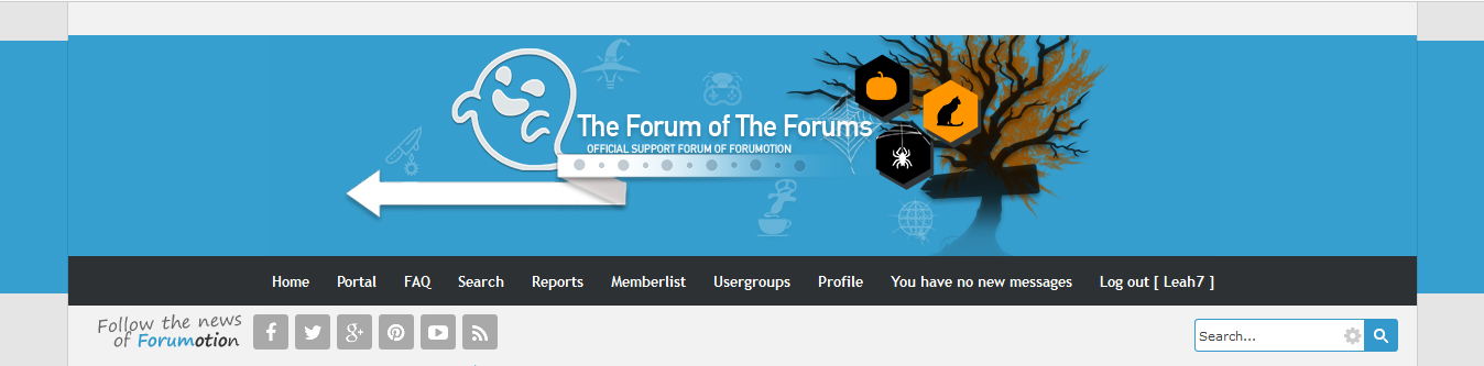
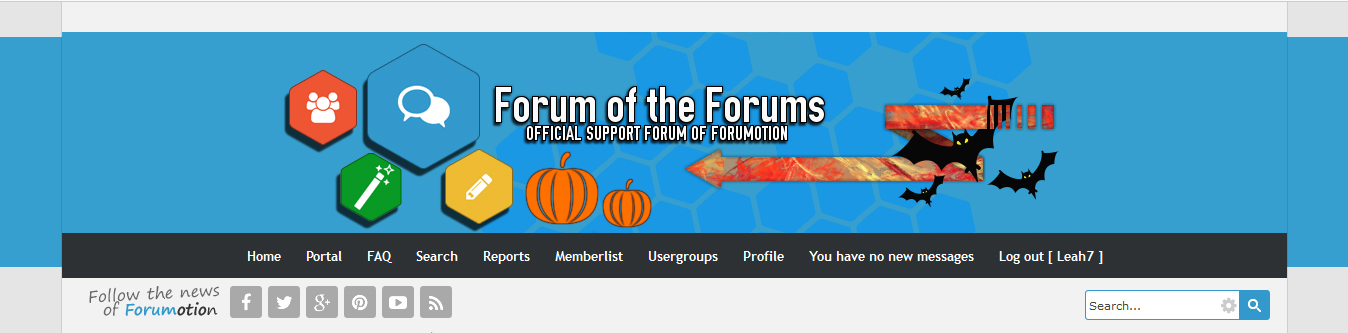
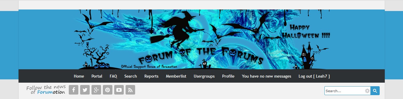
- This banner fits perfectly into the Forumotion Forum, integrating perfectly through color, icons, and style. You have a great sense of movement with your background polygons moving into your bats, which are then directed to your icon set on the left across to the other side of your text through your arrow. Your font is simple and easy to read, the icons still give way to the purpose of the forum, and balance is superb. You have a large icons with three smaller ones on the left and a large bat with three smaller ones on the right with your text placed neatly at the center.
Although your bats and arrow take up much less space than your icons on the right, the background polygon pattern really adds to the empty space that the right side lacks, creating a good harmony for this banner overall. However, your colors don't really harmonize, at all. You have the varied colors on your left, but the orange pumpkins seem to just sit there alone with nowhere to go. The saturated orange takes it away from the darker and less saturated colors that are seen from the rest of the banner. The bats are also a dark black, but there is no black on the left at all, which can also take away from the overall color flow of the piece.
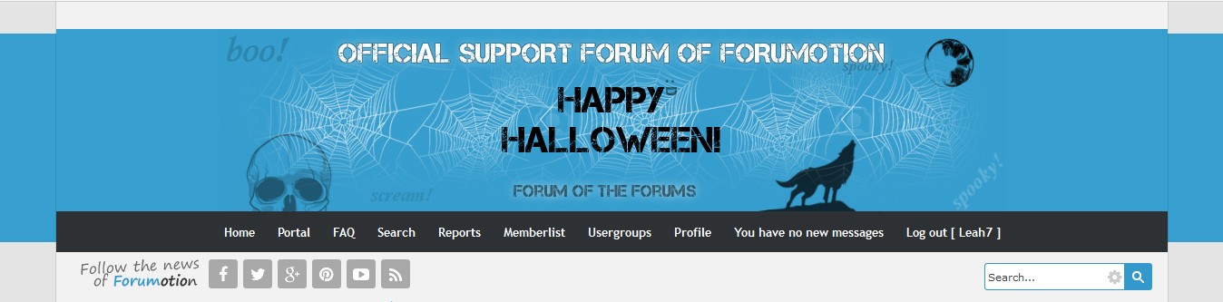
Additionally, I really feel there isn't enough Halloween in this banner. You have bats, which are obviously Halloween like, but the pumpkins could be for "autumn" or "harvest," rather than just Halloween. I really would have liked to see maybe a Halloween font or a few more Halloween icons within to give it more of a horror or dark feel.
And now, I'm gonna nitpick: Your shadows. You have some heavy dark shadows at one angle on your left icons, a short, heavy shadow in another angle on your text, and a shadowed glow on your arrow that tends to make the arrow look fuzzy against the blue background. These different shadows do not take away from your banner, overall, but I do want to say that I recommend using a lighter opacity on your shadows when placing it on a light background like this blue. When the shadow is too dark, it looks more like a blur or fuzzy feel against your icons instead of a drop shadow. I am calling this nitpicking because it doesn't really effect how I view your artwork, overall, and it's more suited to my personal tastes.
Lastly, the challenge image is added, but I feel it could have been incorporated better in your piece, rather than being used as an arrow. The entire purpose of an arrow, generally, is to provide movement within your piece. This still works for your banner, but the pattern that is now added doesn't really go with that movement, leading in different directions throughout and making it seem more chaotic. I love the breaks in the arrow on the farthest right side, because it adds a little originality and style into it, but the challenge image also takes away from this a bit, so I think the image would have been better used elsewhere.
Overall, excellent balance and movement, as well as a marvelous theme integration to fit into our forum's theme. This is a strong submission into our contest and I do hope to see your artwork next time. Thank you for participating into this Graphic Challenge!
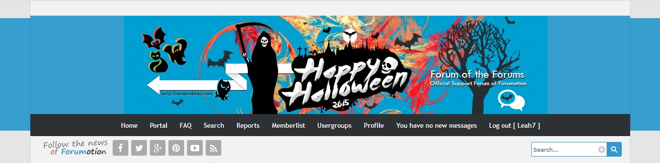
Favorite Features
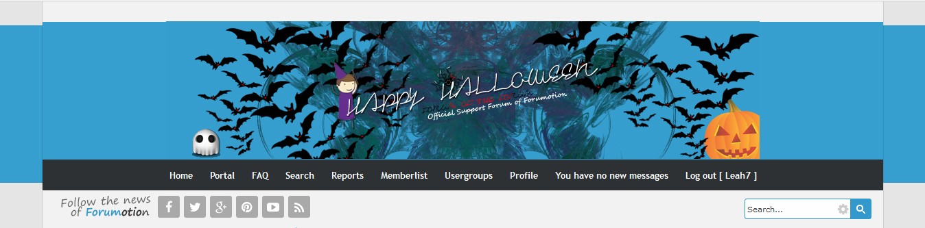
- I love how you added the Forumotion Icons and the background texture--that background texture adds a little movement and flavor to your banner and it fits perfectly with the theme. Excellent work!
Recommended Improvements
- Color Choices, Challenge Completion, & Halloween Effects
|