
 Portal
Backslash Navigator Bar
+8
RikaComet
Mehtevas
KiiD CuDii
Walshy95
Rougewraith
Master Marc
Team101
ShadowSun
12 posters
Page 1 of 1

 Backslash Navigator Bar
 by ShadowSun July 1st 2009, 5:10 am
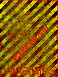
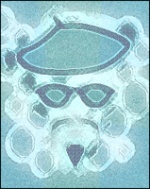
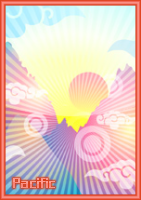
My first navigator bars
For dark forums


For red forums


PLEASE DO NOT ADVERTISE ~RIKA (link removed)
For dark forums
For red forums
PLEASE DO NOT ADVERTISE ~RIKA (link removed)
Last edited by ShadowSun on July 3rd 2009, 5:57 am; edited 2 times in total

ShadowSun- Forumember
-
 Posts : 73
Reputation : 1
Language : english -


Re: Backslash Navigator Bar
by Team101 July 1st 2009, 5:51 am
hey i am ganna use these but i will need some things to be edited

Team101- Forumember
- Posts : 245
Reputation : 0
Language : english -
ShadowSun- Forumember
- Posts : 73
Reputation : 1
Language : english -
Re: Backslash Navigator Bar
by Team101 July 1st 2009, 6:18 am
ok then thanks alot check your pm for more
Team101- Forumember
- Posts : 245
Reputation : 0
Language : english -
ShadowSun- Forumember
- Posts : 73
Reputation : 1
Language : english -
Re: Backslash Navigator Bar
by Master Marc July 1st 2009, 2:46 pm
The font is blur...
You can do better than this.
=> 3/10 ,
You can do better than this.
=> 3/10 ,

Master Marc- Hyperactive
- Posts : 3661
Reputation : 47
Language : English and Spanish.
Re: Backslash Navigator Bar
by ShadowSun July 1st 2009, 2:58 pm
Master Marc wrote:The font is blur...
You can do better than this.
=> 3/10 ,
that because of embossed
ShadowSun- Forumember
- Posts : 73
Reputation : 1
Language : english -
Re: Backslash Navigator Bar
by Rougewraith July 2nd 2009, 8:06 pm
they look great i sent you a request via PM for some
Rougewraith- Forumember
- Posts : 99
Reputation : 0
Language : English
Location : Arkansas/Washington -
Re: Backslash Navigator Bar
by ShadowSun July 3rd 2009, 5:46 am
Rougewraith wrote:they look great i sent you a request via PM for some
request sent to PM
ShadowSun- Forumember
- Posts : 73
Reputation : 1
Language : english -
Re: Backslash Navigator Bar
by Walshy95 July 5th 2009, 4:51 pm
The text hurt my eyes a bit. But their still nice 

Walshy95- Active Poster
- Posts : 1308
Reputation : 6
Language : English
Location : UK, Liverpool
Re: Backslash Navigator Bar
by KiiD CuDii July 5th 2009, 7:27 pm
Looks blurry and cant barely read the text

KiiD CuDii- Active Poster
- Posts : 1118
Reputation : 1
Language : USA -
Re: Backslash Navigator Bar
by Mehtevas July 6th 2009, 1:49 am
I dont like the A's other than that they a very nice.

Mehtevas- Hyperactive
- Posts : 2114
Reputation : 14
Language : Currently, I am receiving support requests by P.M. Support requests, which can, and should, be done in the support section.
Location : Oregon, USA
Re: Backslash Navigator Bar
by RikaComet July 6th 2009, 11:19 am
Shadowsun => reminded, not to advertise your forum here we have a separate area for that here:
https://help.forumotion.com/forum-promotion-forumotions-only-f12/
https://help.forumotion.com/forum-promotion-forumotions-only-f12/
RikaComet- Active Poster
- Posts : 1536
Reputation : 18
Language : English , Hindi , Arabic , Urdu, Japenese , Punjabi , German
Location : thing called Earth
Re: Backslash Navigator Bar
by notMicElf July 6th 2009, 2:14 pm
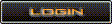
Blurry, and the 'Log In' button's letters move in the first set.
4/10
4/10

notMicElf- Forumember
- Posts : 377
Reputation : 0
Language : English, HTML, CSS, Java
Location : Not where you are =P
Re: Backslash Navigator Bar
by Pacific July 8th 2009, 4:36 pm
They are too blurry and the text is not good at all.
Pacific- Active Poster
-
 Posts : 1736
Reputation : 14
Language : Greek, English, French
Location : Exams finished... going to do as much reviews as I can
Re: Backslash Navigator Bar
by Rok July 9th 2009, 3:27 pm
I don't see why you made these .gif animations. You did the same thing to your ranks as well. I'm sorry, but these look too ugly and blurry.
Navigation bar + .gif =
Navigation bar + .gif =

Rok- Energetic
- Posts : 6823
Reputation : 234
Language : idk
Re: Backslash Navigator Bar
by ShadowSun July 9th 2009, 3:38 pm
Rok wrote:I don't see why you made these .gif animations. You did the same thing to your ranks as well. I'm sorry, but these look too ugly and blurry.
Navigation bar + .gif =
coz i like to made it if you dont like fine if you wont im not insisting my work to you dude. if i want to make anykind of animation it's not your problem
make comment dude dont ask me why i make it if you dont know how to make comment i think better stop posting simple comment i need to improve my work use common sense bro
if you dont know how to make comments i give you an example
give rate : 2/1o, 4/10 or 0/10 or what ever you like
comments: blur, change color, fonts etc. need some improvement etc
same like this if you are making comments not like "why you made .gif or what so ever my answer is simple mind your own business. about my rank for your information i got a bunch of request on it.
and hope you understand the word "BEGINNER" or "FIRST TIME"
ShadowSun- Forumember
- Posts : 73
Reputation : 1
Language : english -
Re: Backslash Navigator Bar
by Jalokim July 9th 2009, 6:12 pm
Ah, so this is the proposal that started the thread in the GD.
I have a few pointers here.
First, since its your first time, you actually have nothing to say.
You should take all the critique and use it. I mean if its your first time mopping at mcdonalds you not gonna tell the janitor that he is wrong?
the nav bars, are hard to read and are pixelated, I believe this is thanks to the gif format.
Clear fonts are the most important, you have to reduce your font bevel. Its read first , design later
locked

Jalokim- Energetic
- Posts : 6113
Reputation : 223
Language : English,Polish,CSS,HTML
Location : Poland
» Navigator Bar
» Header and navigator
» Navigator request!
» PleaseCreate Me a Dark Navigator?
» Navigator on the side
» Header and navigator
» Navigator request!
» PleaseCreate Me a Dark Navigator?
» Navigator on the side
Page 1 of 1
Permissions in this forum:
You cannot reply to topics in this forum Facebook
 Twitter
 Pinterest
 Youtube
