
 Portal
Warning Bars
+9
Jalokim
Dark Takua
Master Marc
Rok
Tarogasini
ConMan77777777
Cman
ForumBooster
Krazyguy
13 posters
Page 1 of 1


Krazyguy- Forumember
-
 Posts : 40
Reputation : 0 -


ForumBooster- Forumember
- Posts : 211
Reputation : 0
Language : perlagotchi -
 Re: Warning Bars
 by Cman June 8th 2009, 9:38 pm
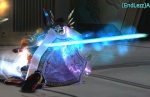
i like the sparckle, the font, and the explanation mark, 9/10

Cman- Forumember
- Posts : 681
Reputation : 5
Language : English
Location : Florida -
Re: Warning Bars
by ConMan77777777 June 8th 2009, 9:52 pm
Let's see.
Good:
1. Sparkles
2. Creative
Bad:
1. The red is too dark
2. Bad Font
3. The ! sign
Total I would say 8/10.
Good:
1. Sparkles
2. Creative
Bad:
1. The red is too dark
2. Bad Font
3. The ! sign
Total I would say 8/10.

ConMan77777777- Forumember
- Posts : 145
Reputation : 0
Language : English
Location : USA
Krazyguy- Forumember
- Posts : 40
Reputation : 0 -
Re: Warning Bars
by Tarogasini June 9th 2009, 4:18 am
Its appreciated that you are innovative and stuff... But :
♣ I simply dont like such designs. Warning bars should be simple bars, 1 effect on them( or not ) and thats it. If you ask ME, but people dont ask me
♣ I found the exclamation sign unneeded
♣ Font is bad and hard to read
♣ I dont like the stars or the sparks or whatever that is
♣ +1 for the effort and "innovation"

Tarogasini- Active Poster
- Posts : 1351
Reputation : 9
Language : English
Location : Simplicity is my style.

Rok- Energetic
- Posts : 6823
Reputation : 234
Language : idk
Re: Warning Bars
by Master Marc June 10th 2009, 8:06 pm
I also like them.Rok wrote:I like the effects; Great work!
Keep it up Krazyguy.But,I don't like the color of this warning bar ~
 ,
, 

Master Marc- Hyperactive
- Posts : 3661
Reputation : 47
Language : English and Spanish.
Re: Warning Bars
by Dark Takua June 10th 2009, 8:19 pm
great job, I think you should make it :
green - yellow - lighter yellow - Banned(black)
8/10
green - yellow - lighter yellow - Banned(black)
8/10

Dark Takua- Active Poster
- Posts : 1012
Reputation : 23
Language : English -
Re: Warning Bars
by Jalokim June 11th 2009, 4:41 am
I also think the sign is uneeded...
it kinda makes you think that you already done something wrong even though you are green.
remove the icon or this thread gets removed
it kinda makes you think that you already done something wrong even though you are green.
remove the icon or this thread gets removed

Jalokim- Energetic
- Posts : 6113
Reputation : 223
Language : English,Polish,CSS,HTML
Location : Poland

Mystic_gohan2- Forumember
- Posts : 700
Reputation : 30
Language : English
kjmj14- Forumember
- Posts : 795
Reputation : 8
Language : English
Location : World -

Matei- Hyperactive
- Posts : 2973
Reputation : 101
Language : Romanian (10), English (8), * CSS Stylessheet | HTML *
Location : Romania | Please do not send me pm`s for support or graphic requests, I just ignore them.
Re: Warning Bars
by cync June 11th 2009, 6:40 am
Where can i put thats warning bar??
Sorry if out of topic..
Sorry if out of topic..
cync- New Member
- Posts : 14
Reputation : 0
Language : english, indonesia
Matei- Hyperactive
- Posts : 2973
Reputation : 101
Language : Romanian (10), English (8), * CSS Stylessheet | HTML *
Location : Romania | Please do not send me pm`s for support or graphic requests, I just ignore them.
» Ranks, Navigation bars, Warning bars
» Ranks, Navigation bars, Warning bars
» Warning bars
» HOW DO I ADD WARNING BARS
» How do I add warning bars?
» Ranks, Navigation bars, Warning bars
» Warning bars
» HOW DO I ADD WARNING BARS
» How do I add warning bars?
Page 1 of 1
Permissions in this forum:
You cannot reply to topics in this forum Facebook
 Twitter
 Pinterest
 Youtube
