
 Portal
Cutted ranks
+6
Ange Tuteur
DustyBones
levy
iyaaz
BlackScorpion
vaccam
10 posters
Page 1 of 1

 Cutted ranks
 by vaccam March 13th 2014, 9:38 pm
Font:Arabic Typesetting
Font Size:25
Blank Image:N/A
Creation File:PNG
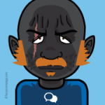
So i made these, i just wanted to make a seperate "rank" for the icon itself. You might noticed the white cuts, i added that because something was wrong with the "rank background" so i added it.
Please give me all feedback!


Thanks guys and girls
Best regards
Vaccam
Font Size:25
Blank Image:N/A
Creation File:PNG
So i made these, i just wanted to make a seperate "rank" for the icon itself. You might noticed the white cuts, i added that because something was wrong with the "rank background" so i added it.
Please give me all feedback!
Thanks guys and girls
Best regards
Vaccam
vaccam- Forumember
- Posts : 371
Reputation : 14
Language : Norwegian
Location : Norway -


Re: Cutted ranks
by BlackScorpion March 13th 2014, 10:00 pm
Not bad, I don't know if it's my screen but the text seems blurry. Also you can use the $ symbol for VIP or Donator rank. Try using the gradient tools, it will give it a nice look.


Graphic Design Section Rules || Becoming a Designer || Graphic Requests
Graphics Request Form
Make sure to check out our FREE Graphic's Gallery
No support provided via PM!

BlackScorpion- Graphic Designer

-
 Posts : 7010
Reputation : 919
Language : English
Location : USA -
Re: Cutted ranks
by vaccam March 13th 2014, 10:06 pm
BlackScorpion wrote:Not bad, I don't know if it's my screen but the text seems blurry. Also you can use the $ symbol for VIP or Donator rank. Try using the gradient tools, it will give it a nice look.
Thanks, it is not blurry on my screen. I will try both of them, could you maybe rate them for example (7/10), ahahha.
vaccam- Forumember
- Posts : 371
Reputation : 14
Language : Norwegian
Location : Norway -
iyaaz- Forumember
- Posts : 350
Reputation : 8
Language : English
Location : London -
Re: Cutted ranks
by vaccam March 13th 2014, 10:15 pm
iyaaz wrote:Yes it's seems bit blurry .. 8/10
Really :O I cant see it, thanks
vaccam- Forumember
- Posts : 371
Reputation : 14
Language : Norwegian
Location : Norway -
Re: Cutted ranks
by levy March 13th 2014, 10:36 pm
Are pretty nice but you can work more for icons 
9/10
9/10
levy- Hyperactive
- Posts : 2632
Reputation : 350
Language : English, Romanian
Location : Romania -
Re: Cutted ranks
by vaccam March 13th 2014, 10:38 pm
candy_fear wrote:Are pretty nice but you can work more for icons
9/10
Thanks, i wanted the icons to be simple. I like simple icons
Thanks for good rating !
vaccam- Forumember
- Posts : 371
Reputation : 14
Language : Norwegian
Location : Norway -
Re: Cutted ranks
by DustyBones March 13th 2014, 11:44 pm
Not to bad..
I agree that the text is a little fuzzy. If you blow it up you'll see the light pixels around the lettering. When the text does that, I erase the offending pixels to clean up the lettering.
Also there is white in the corners that will show up when placed on a darker background. Not sure how you got that but transparent would be better.
You could also add a 1 or 2 pixel bevel. Some like that, some don't but you could try it and see if you like it. Some things it looks good on, others not so much.
A darker stroke would also help the ranks pop off the page.
Bottom line is that you have to come up with your own style and hopefully others will like your 'visions'. You can't make everyone happy but you have to play with different styles and techniques to find what appeals to you. Find other peoples work that really appeals to you and enlarge their work and see if you can figure out what they did and what you would need to do to make something like it. That will teach you tons and there is lots of tutorials on line to learn the different techniques.
You are improving so keep it up and practice, practice, practice...

DustyBones- Active Poster
- Posts : 1234
Reputation : 528
Language : English
Location : Washington, USA -
Re: Cutted ranks
by vaccam March 13th 2014, 11:48 pm
DustyBones wrote:Not to bad..
I agree that the text is a little fuzzy. If you blow it up you'll see the light pixels around the lettering. When the text does that, I erase the offending pixels to clean up the lettering.
Also there is white in the corners that will show up when placed on a darker background. Not sure how you got that but transparent would be better.
You could also add a 1 or 2 pixel bevel. Some like that, some don't but you could try it and see if you like it. Some things it looks good on, others not so much.
A darker stroke would also help the ranks pop off the page.
Bottom line is that you have to come up with your own style and hopefully others will like your 'visions'. You can't make everyone happy but you have to play with different styles and techniques to find what appeals to you. Find other peoples work that really appeals to you and enlarge their work and see if you can figure out what they did and what you would need to do to make something like it. That will teach you tons and there is lots of tutorials on line to learn the different techniques.
You are improving so keep it up and practice, practice, practice...
Thanks that was a really good feedback,
Im am always working on transparent backgrounds, but something really got messed up with the corners, and the only color that i could put there was white. I have some experience with bevel but sometimes i dont like it, i never had the though of putting bevel in these small ranks, i always thought that that were for logos and banners. Will try next time.
Once again great feedback, helps me alot here. Thank you for your honesty and you help.
Help to you 10/10
vaccam- Forumember
- Posts : 371
Reputation : 14
Language : Norwegian
Location : Norway -
Re: Cutted ranks
by Guest March 14th 2014, 3:03 am
Nice Improvement, vaccam!! You work keeps getting better! =) Wonderful work!

Guest- Guest
Re: Cutted ranks
by vaccam March 14th 2014, 6:59 am
Leah7 wrote:Nice Improvement, vaccam!! You work keeps getting better! =) Wonderful work!
Thank you Leah !
vaccam- Forumember
- Posts : 371
Reputation : 14
Language : Norwegian
Location : Norway -
Re: Cutted ranks
by Ange Tuteur March 14th 2014, 7:20 am
Very good. 
I would probably take an eraser to the corners; make sure its soft too, just to remove that white. If put on a dark forum those corners would really stand out. KIU
I would probably take an eraser to the corners; make sure its soft too, just to remove that white. If put on a dark forum those corners would really stand out. KIU

Ange Tuteur- Forumaster
- Posts : 13246
Reputation : 3000
Language : English & 日本語
Location : Pennsylvania -
Re: Cutted ranks
by vaccam March 14th 2014, 8:20 am
Ange Tuteur wrote:Very good.
I would probably take an eraser to the corners; make sure its soft too, just to remove that white. If put on a dark forum those corners would really stand out. KIU
Thanks !
vaccam- Forumember
- Posts : 371
Reputation : 14
Language : Norwegian
Location : Norway -
Re: Cutted ranks
by ***AFINA*** March 15th 2014, 6:56 pm
You didn't try to put imagination in your work. Simple regular font without additions, same as buttons shape... And each can put downloaded icons from internet.
I would say 2/10.
I would say 2/10.

***AFINA***- Forumember
-
 Posts : 450
Reputation : 28
Language : English, Russian, Ukrainian, Greek, Photoshop
Location : The whole world
Re: Cutted ranks
by vaccam March 15th 2014, 9:56 pm
***AFINA*** wrote:You didn't try to put imagination in your work. Simple regular font without additions, same as buttons shape... And each can put downloaded icons from internet.
I would say 2/10.
How would you know that? Even if i am not at your level you cannot say that i didnt put imagination in my work. I tried my best, stop criticizing people. If you dont like their work do some of your own. Simple fonts are often the best and the most good looking. The shape was suppose to be that way and ofc you can download icons from the internet. I like the icons simple.
vaccam- Forumember
- Posts : 371
Reputation : 14
Language : Norwegian
Location : Norway -
Re: Cutted ranks
by JennyorAlice March 17th 2014, 1:34 am
I like these. They are simple, however, I like that you use some different icons with different ranks. Good job! 10/10

JennyorAlice- Active Poster
- Posts : 1204
Reputation : 55
Language : U. S. English
Location : U. S. A. -
Re: Cutted ranks
by vaccam March 17th 2014, 1:35 am
Bazinga! wrote:I like these. They are simple, however, I like that you use some different icons with different ranks. Good job! 10/10
Thanks mate !
vaccam- Forumember
- Posts : 371
Reputation : 14
Language : Norwegian
Location : Norway -
Re: Cutted ranks
by BlackScorpion March 17th 2014, 3:16 am
***AFINA*** wrote:You didn't try to put imagination in your work. Simple regular font without additions, same as buttons shape... And each can put downloaded icons from internet.
I would say 2/10.
This is a bit harsh. If you were following vaccams progress you would have know he is a beginner. So him posting his creations to us to be criticised takes alot.
BlackScorpion- Graphic Designer
- Posts : 7010
Reputation : 919
Language : English
Location : USA -
Re: Cutted ranks
by Sir Chivas™ March 17th 2014, 3:36 am
Honestly, they aren't that bad. Just follow the tips that everyone gave above. It reminds me of my times. You will get better at it. 

Sir Chivas™- Helper

- Posts : 6983
Reputation : 457
Language : EN, FR, ES
Location : || CSS || HTML || Graphics Designs || Support || -
 Thanks for the support guys ! Means alot
vaccam- Forumember
- Posts : 371
Reputation : 14
Language : Norwegian
Location : Norway -
Re: Cutted ranks
by skouliki July 20th 2017, 6:47 pm
Because of this https://help.forumotion.com/t153309-photobucket-update , this will be sent to the garbage.


skouliki- Manager

- Posts : 15133
Reputation : 1696
Language : English,Greek
Location : Greece -
» Images are cutted...
» To Have 2 ranks (Special ranks + Post count ranks)
» Ranks For Specific Categories & Choose Unlocked Ranks
» Moderator ranks and members ranks not showing up
» Special Ranks AND Post Number Ranks
» To Have 2 ranks (Special ranks + Post count ranks)
» Ranks For Specific Categories & Choose Unlocked Ranks
» Moderator ranks and members ranks not showing up
» Special Ranks AND Post Number Ranks
Page 1 of 1
Permissions in this forum:
You cannot reply to topics in this forum Facebook
 Twitter
 Pinterest
 Youtube
